
Artoil opens in Ufa
The second Artoil station has opened to much aclaim in the Urals city of Ufa. The first station in the wealthy Moscow suburb of Rublevka caused quite a stir but not as much as Ufa where retail is still a few years behind. Ufa customers were very pleasantly surprised that an oil company had finally decided to present its offer up to the standard and beyond of any other major shopping centre retailer. See russian tv story.
Minale Tattersfield head of retail David Davis comments that it was great to see that such a city as Ufa should benefit from outside investment dedicated to bringing some colour to a normally dreary and functional retail sector. It was also a personal milestone for owner Rishat Safin who is native to this region.
Photo and construction courtesy of Etalon.

Repsol Solar Water Heating Car Wash

Outside Barajas airport in Madrid can be seen solar panels on top of the Repsol jet wash bays. Look closer and it’s clear that these are not solar PV electricity generators which have appeared on petrol station canopies over recent years but water heaters for supplying warm water at the jet wash nozzle.
By using solar water heaters in this way Repsol will gain from offsetting the cost of either a gas fuelled heater or an electricity fuelled heater. Savings will be manifest not only as reduced energy bills but reduced maintenance costs for conventional heating apparatus.
...but why not communicate the environmental benefits more obviously?
Some big ideas just keep on getting bigger

In July 2008 we were asked by Harlequins Rugby Club to create a brand for what would be the biggest event in their calendar.
Their idea back then was to stage a match just after Boxing Day which would take place at the country’s largest rugby stadium, Twickenham. Instead of their usual crowd of 13,000 at their home ground they would have to attract a crowd of 50,000. (Twickenham actually holds over 80,000 but due to the lack of public transport over Christmas they were not allowed to sell more than 50,000 tickets).
So the challenge was to put together a campaign that would sell four times more tickets than was usual for a club match.
Their idea back then was to stage a match just after Boxing Day which would take place at the country’s largest rugby stadium, Twickenham. Instead of their usual crowd of 13,000 at their home ground they would have to attract a crowd of 50,000. (Twickenham actually holds over 80,000 but due to the lack of public transport over Christmas they were not allowed to sell more than 50,000 tickets).
So the challenge was to put together a campaign that would sell four times more tickets than was usual for a club match.
A big challenge calls for big thinking, and big thinking led to the big
brand. So it was that Minale Tattersfield created the Big Game brand
as well as all the promotional material. The event was highly successful
with all tickets sold. Its success led in 2009 to Big Game 2 and Minale Tattersfield was tasked with producing an even bigger campaign with promotional material including a short film, posters for buses and train stations, newspaper advertisements, leaflets etc. This time the authorities relented and allowed 80,000 tickets to be sold so the challenge had got bigger. The campaign obviously hit the mark because virtually all 80,000 tickets were sold.
Now in the run up to the end of 2010 the Big Game is still going strong. Big Game 3 is being promoted throughout London and another full house is expected. The original Minale Tattersfield promotional material is being updated for this year’s campaign. Although the updating is not being carried out by Minale Tattersfield, the brand template has already been clearly established. The look and feel, brand values, colour palette, layout and photographic style have been set out so precisely that it is easy for the club to now insert the latest details.
The Minale Tattersfield ethos is to build brands on firm foundations.
The foundation is to understand fully the client’s objectives, the customer motivation and the competitive set. So the customer motivation was all about getting out after the Christmas blowout to something that could be enjoyed by all the family that would be different and special. The big idea to communicate this was the idea of a Hollywood blockbuster or epic.
We think the Big Game will run and run.
A look into our archives

As examples that showed creativity, with layers of meaning and a strong idea behind them where three identities, of which two where ours, The Royal Armouries Museum and The London Transport Museum. The third identity mentioned was The National Grid by John McConnell.
This article tempted us to a bit of nostalgia (typically a bad word with us) and we took a look at our archives to remind ourselves of these two identities we had created during the 1990s.
The London Transport Museum identity was commissioned between 1992 and 1993. The art director responsible was Alex Maranzano, (retired from Minale Tattersfield in 2009) and the senior designer was Jon Unwin (today he is Graphic Design Programme Leader at Falmouth Collage - http://www.falmouth.ac.uk/component/contacts/352/view/design-graphic-design-bahons-119/jon-unwin-105/index.html).

The brief was to develop a new identity as part of the London Transport Museum’s refurbishment programme. This needed to be compatible with the classic London Transport identity and expressive of the relationship between a great urban transportation system and the people using it – past, present and future.

Our solution was selecting different people from different times travelling on London Transport. From a top hatted Victorian gentleman to a modern passenger time appears to be speeding up as we reach the present day. A case of travel, traveling through time…


In 2008 the London Transport Museum went through another major refurbishment and the identity was dropped in favour of the famous TfL roundel. However powerful and iconic the roundel is we feel that the museum has lost its own personality as a place of transport enlightenment and delight and now resembles more the depository of Transport for London’s decommissioned transport vehicles. The London Transport Museum website is http://www.ltmuseum.co.uk/


The Royal Armouries identity was commissioned between 1995 and 1996 and was the last project Brian Tattersfield, one of our founding partners, art directed and personally worked on before retiring.
The brief was to design the visual identity and signage for the then newly built Royal Armouries Museum in Leeds.

The solution was to base the identity on one of the most extraordinary objects in the collection – a grotesque horned helmet, all that remains of a suit of armour made for King Henry VIII. Visually startling, elegant, beautifully crafted but slightly sinister, this helmet embodied all the qualities inherent in the collection. E.g. Weapons with the purpose of maiming and killing which are, yet, so beautifully crafted and fascinating to look at.


Outside the main entrance two granite columns presented the mask in 3D to greet visitors as they enter. Because of the simplicity of the building there was no conventional sign system required, instead a secondary set of symbols where created to identify the main areas of the museum, from the horrors of war to the thrill of the tournament. Visitors would then be directed to these areas by huge banners which would hang the full height of the internal street.


At the time of presenting our design concepts to the museum’s curators we also highlighted that the name Royal Armouries Museum, could eventually be abbreviated to RAM, an appropriate anagram seeing the famous helmet used ram horns which are symbolic for confrontation and warfare.

Sadly over the last years the identity has slowly diminished to near oblivion and replaced by a somewhat anodyne and rather boring identity. The Royal Armouries Museum website is http://www.royalarmouries.org/home
Lukoil look alike

Deep in the far east of Russia near Vladivostok lies a red and white petrol station. At first glance the station appears to be of the market leader Lukoil. Look a bit closer and you realise it’s Oktant. When we asked the attendant if they were a branch of Lukoil we got a ‘Nyet’ and would we mind leaving (not so politely). Ironically the shop offer was far better than any you would find on a real Lukoil site. Why not develop your own brand guy’s!....and as for Lukoil, is your brand of such little value to you that you allow imposters?
Logos explanied
A review of Deconstructing Logo Design by Matthew Healey,
published by Rotovision
 For nearly 40 years Rotovision has been recognised as the publisher of choice for books on the visual arts, graphic design, photography, illustration, digital design and craft reference. Their mission is to highlight innovation and excellence in all these areas of design and to explore the process, creative techniques and inspiration that make the work stand out.
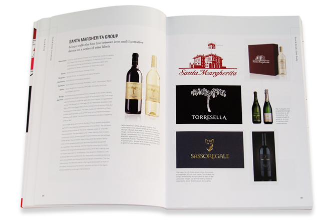
Matthew Healey has just written the latest book on design to be published by Rotovision. The book entitled Deconstructing Logo Design follows a number of other books from the same publisher on the intriguing subject of logos. Matthew Healey is a brand consultant, graphic designer and lecturer who has worked in advertising agencies in New York and Prague, is a member of the Design Management Institute in Boston and has lectured on branding, advertising and marketing throughout Europe and the USA.


The book is an invaluable guide to all those designers who work within the realm of corporate identity design and for those who seek to sell their services as well as to corporate communicators and marketeers who need to promote their own organisations.
published by Rotovision

Matthew Healey has just written the latest book on design to be published by Rotovision. The book entitled Deconstructing Logo Design follows a number of other books from the same publisher on the intriguing subject of logos. Matthew Healey is a brand consultant, graphic designer and lecturer who has worked in advertising agencies in New York and Prague, is a member of the Design Management Institute in Boston and has lectured on branding, advertising and marketing throughout Europe and the USA.
The book gives an interesting insight into the ways that leading designers from around the world create the logos of today to communicate the values of a client’s brand. The challenge of today’s designers is to always create an identity that is original and will make their client stand out from its competitors whilst ensuring the result is functional and comprehensible. Designers must therefore be forever pushing forward the boundaries to provide client satisfaction. In this multi-media age a good visual expression of a brand , beginning with a logo seems to be more critical than ever.

The concept of a logo as set out in the book is to work on a number of levels:
• On the most basic level the logo needs to refer to the brand’s name
• On the next level, it may impart the offering behind the brand, although this is often not done, either because the offer is too complex or else the stand out is provided by the ethos or vision
• On a higher level, the logo needs to advance the broader strategic goals of the organisation to a specific audience
• Finally the logo ought to convey an implicit sense of the values, aspirations and promises the brand lets its consumers embrace.

300 international logos are presented and analysed as to how they meet the four objectives set out above. It is interesting that the logos are picked from the work of small agencies and individual designers as well as from such established and distinguished agencies as Fitch (10 examples), Interbrand (16 examples), Minale Tattersfield (9 examples), Landor (4 examples) and Siegel & Gale (10 examples). The designs featured had a certain universality about them and a number of design techniques in common, no matter what the country of origin which is probably not surprising given that organisations now want to communicate to a world audience and that all designers are able to keep abreast of design developments from around the world via the internet.
The book is an invaluable guide to all those designers who work within the realm of corporate identity design and for those who seek to sell their services as well as to corporate communicators and marketeers who need to promote their own organisations.
If you’ve got it – flaunt it!
In my childhood in the 1950s and 1960s the oil companies were among the most visible brand advertisers – especially on the new medium of television. Challenge a baby boomer today to sing for you “The Esso sign means happy motoring” or “You’re going well you’re going Shell” and most will be able to oblige. But the quadrupling of oil prices in the early 1970s put a stop to all that and whilst there have been occasional flurries of brand advertising in this sector since there has rarely been a period of determined product differentiation advertising. So how should we see Shell’s current UK campaign to promote a new fuel, Shell FuelSave which offers drivers improved fuel efficiency of “Up to one litre per tank” – you can see the TV Commercial here?
Let’s go back to first principles about brand promotion – rules that apply to any sector at any time. There are essentially three components/stages to the putting together of a successful brand differentiation campaign:
1. Design or develop a distinctive product or service
2. Find a creative way of communicating the brand benefits
3. Allocate sufficient media funds to reach your target group effectively.
Let’s review Shell’s new offer against these criteria:
1. In a market in which petrol is seen as a commodity and where the only differentiator is price then Shell’s offer is distinctive and relevant. It is not particularly original in a historical perspective – students of advertising or aging juveniles like me will remember Super Shell with ICA in the 1960s – Super Shell with Platformate in the United States? Take a look at this TV Commercial from 1962. The proposition is identical to that of Shell Fuelsave fifty years later and there is nothing inherently wrong in that. There are really only three fuel differentiation options – Performance, Economy or Environmental benefits. The last named requires an unlikely degree of altruism on the part of the buyer and few will be prepared to pay extra to be green. Performance is a hot button for some and Shell has often had performance advantages as one of the elements for a differentiated fuel (they still do with the premium-priced Shell V-Power). But the real killer proposition should be, as it always has been, economy. If you can get more miles per gallon for the same price you should have a winner - and that’s what Shell Fuelsave offers.
2. The man in the white coat creative treatment is about as old as advertising itself and Shell’s latest version of this is pretty clichéd and predictable. It is supported by other media – including this promotional video which rather cleverly personalises the technology breakthrough. But it is intriguing that Shell fell back on the Scientist representation rather than getting a direct customer endorsement. Maybe the later is planned for the second phase of the communications – if there is to be one. Alternatively Shell could have created a much more metaphorical advertisement without the strong rational reason to believe that they have in their chosen creative. They have done it before – for example in this ad from the United States. The world of TV advertising is so diverse and cluttered these days that the challenge to be distinctive creatively is a considerable one – and to secure client approval for an attention getting creative idea may also often be difficult – especially if that client comes from the rational/scientific world of an oil company. One suspects that the “man in the white coat” Shell FuelSave ad was what the client wanted – even though the Agency creative department must have known how corny an idea it was! I doubt that it will win too may creative awards – whether it wins advertising effectiveness awards relies on something else – its reach.
3. The reach that any brand advertising has is a direct consequence of its media selection and budget. True fine creative will have impact even if the budget bucks are limited – but in most campaigns the more you spend the more reach you will secure. And this is where I fear that Shell FuelSave may fall down. That there was any TV advertising at all for a differentiated fuel product was something I suppose but ask yourself how often you personally have seen the TV Commercial – if at all. I haven’t seen the figures but my guess is that Shell’s media budget for the launch campaign of Shell FuelSave was quite modest and that there has been a real danger of the ad getting lost amongst the all the other strongly funded FMCG and other consumer advertising that is around. And given the frankly pedestrian nature of the creative I doubt whether the brand has really established itself top of the mind with the motorist. The on-site promotion and signalisation has been good and motorists will certainly have seen the brand on site or when they pass the site by. But have the distinct advantages of the brand really lodged themselves in the mind of the buyer? That will be seen from research and, of course, from the ultimate test of sales revenues.
Paddy Briggs
October 2010


 Posts
Posts



